
Work / Tailix — one home for pet life
Tailix — one home for pet life.
Brand identity and the full mobile-app UI for Tailix, Qatar's all-in-one pet marketplace — 40+ screens across 10+ flows: shop supplies, book grooming and veterinary services, adopt, manage a pet profile, and connect with a community.
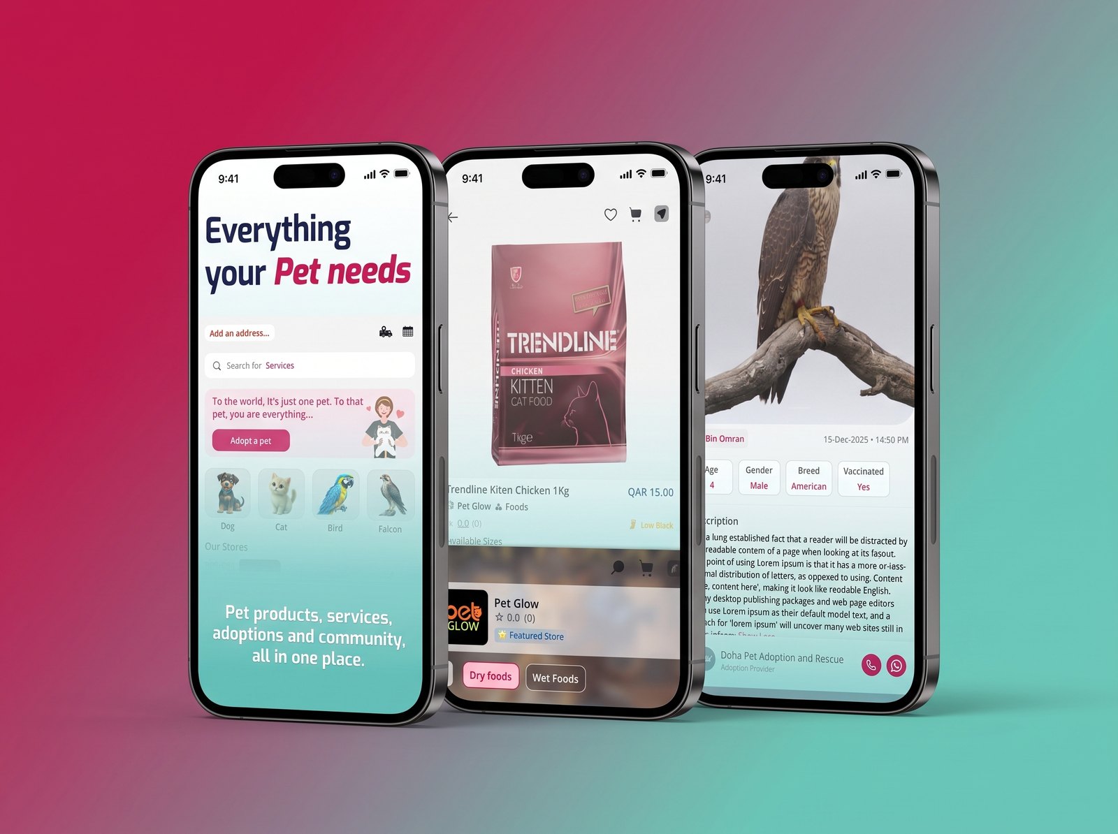
Tailix set out to be one home for pet life in Qatar — shopping, services, adoption and community in a single app. We built it from the brand up: a warm, confident identity and the complete product UI behind it.
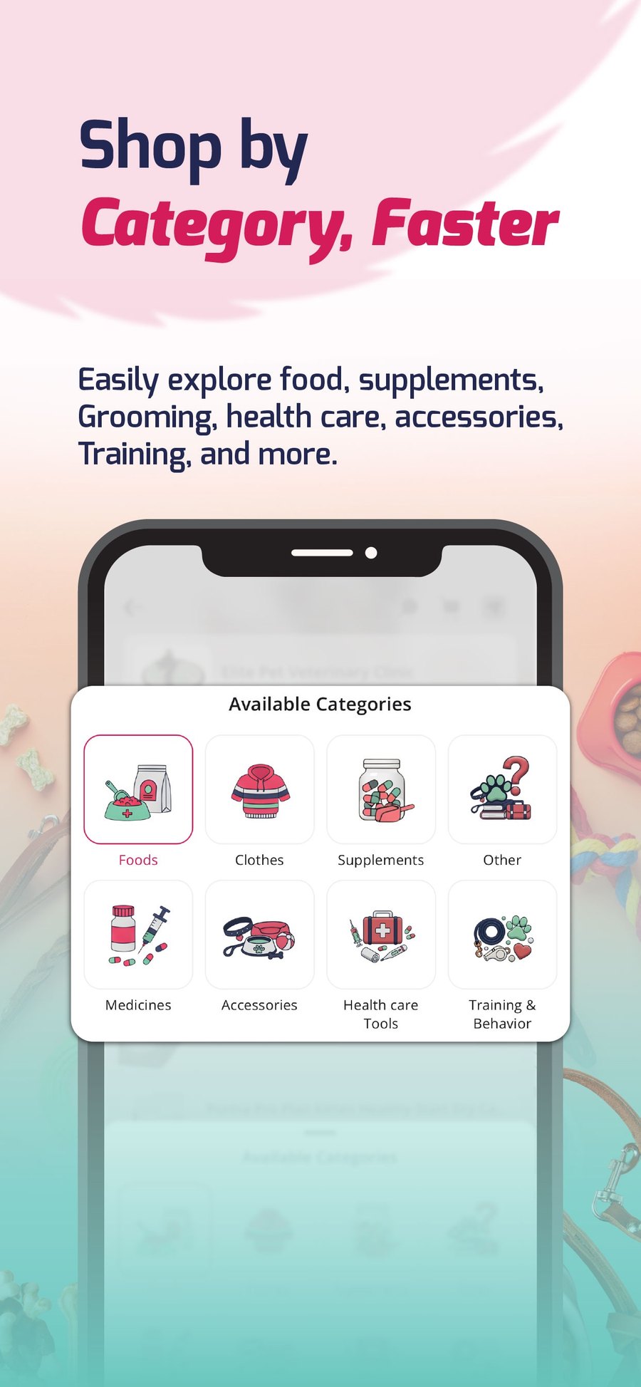
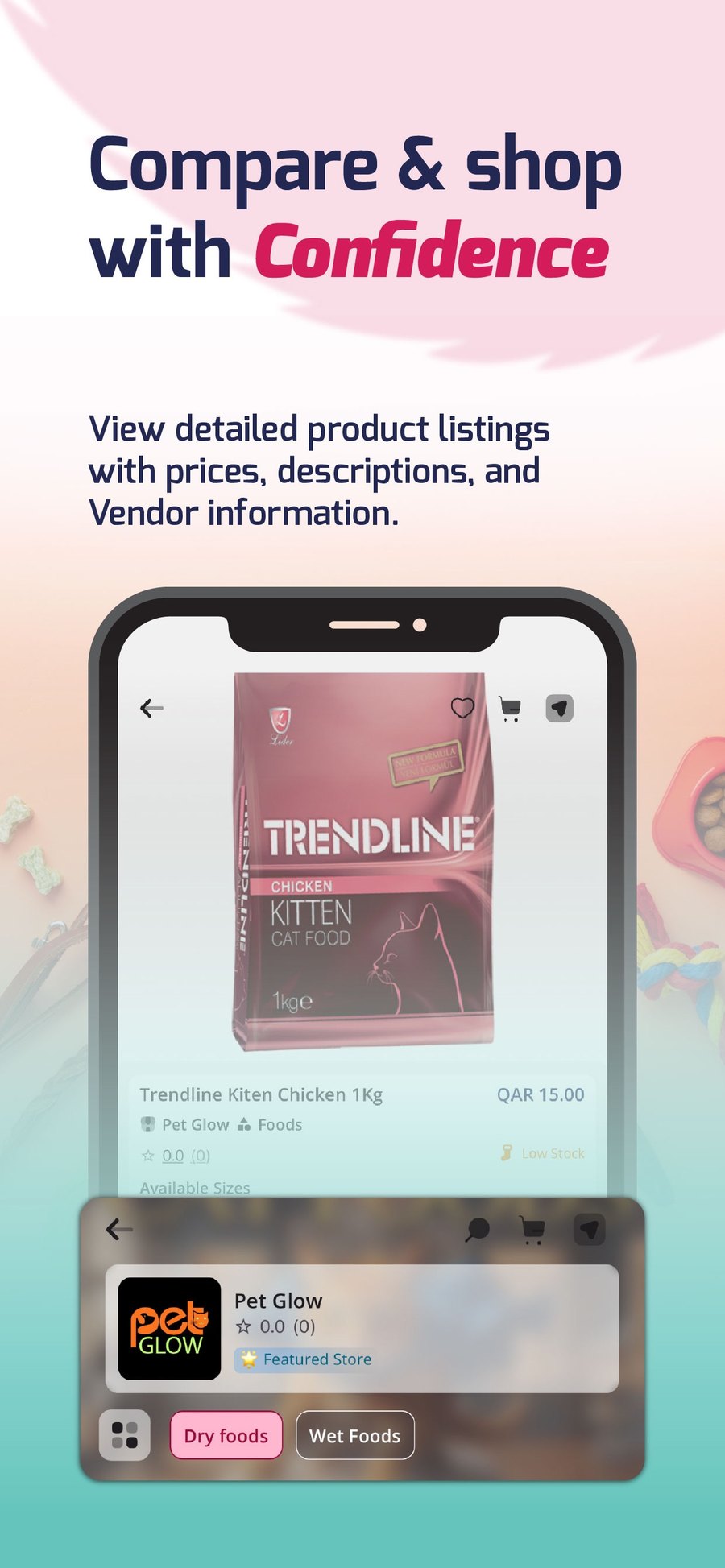
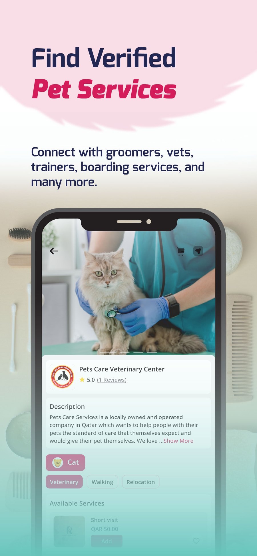
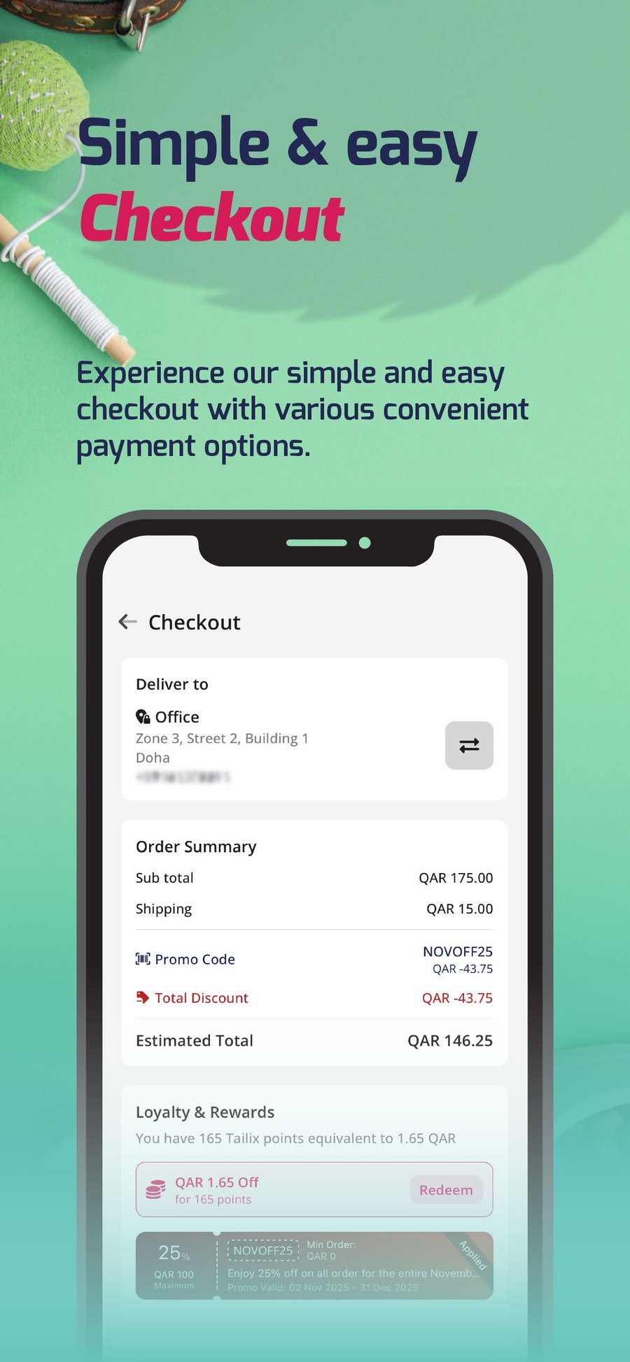
The design spans more than forty screens across ten-plus flows — sign-up, address, search, pet services, bookings, shops, cart, orders, community and pet profiles — all held together by one calm, playful system.
· The challenge
One app for all of pet life.
Qatar's pet owners were juggling separate places to shop, book a vet, and adopt. Tailix wanted a single app for all of it — and a brand that felt trustworthy and playful at the same time, in English and Arabic.
That meant designing not a handful of screens, but a whole product: onboarding, search, services, bookings, commerce, orders, community and pet profiles — dozens of screens that all had to feel like one place.
40+
Screens designed
10+
App flows
iOS
Launched
1
New brand system
· How we designed it
A brand and a system, together.
01 — The brand
A confident crimson paired with a fresh mint and deep navy ink — warm, modern and unmistakably Tailix, from the app icon out.
02 — A rounded language
A friendly rounded sans with bold italic accents; pill buttons, soft 20px cards and gentle shadows give the whole app one calm, tactile feel.
03 — Pastel flows
Each journey — shop, services, checkout, adopt, community — gets its own calm pastel backdrop, so busy commerce screens still feel light and scannable.
04 — Built as a system
Shared components and tokens across 40+ screens and 10+ flows, designed bilingual-ready (EN/AR) from day one — so the product can grow without redrawing the rules.
· Design system
The colours.
A confident primary, a fresh secondary, and calm pastel surfaces that let the products and pets stand out.
Crimson
Primary
#D21152
Mint
Secondary
#5DCCBC
Ink
Text
#1E243E
Blush
Surface
#F9E1E8
Mist
Surface
#E8F6F6
Sky
Surface
#B6E2EC
· Design system
The type.
Rounded and friendly for headlines; clean and legible for everything you tap.
Everything your pet needs
Rounded display
Headlines — bold rounded sans with italic keyword accents
Shop, book & adopt
Clean sans
Body & UI — legible, generously spaced, bilingual-ready
· Client & partners
Made with.
The organisations behind the work.
· The screens
Inside the app.
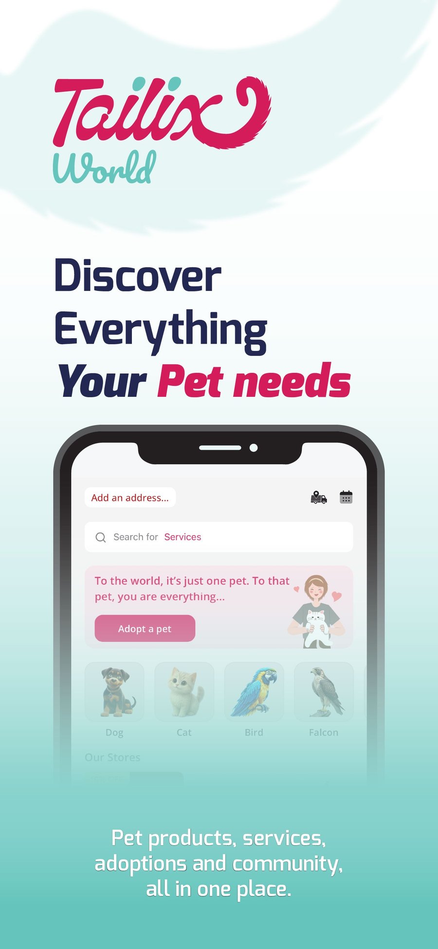
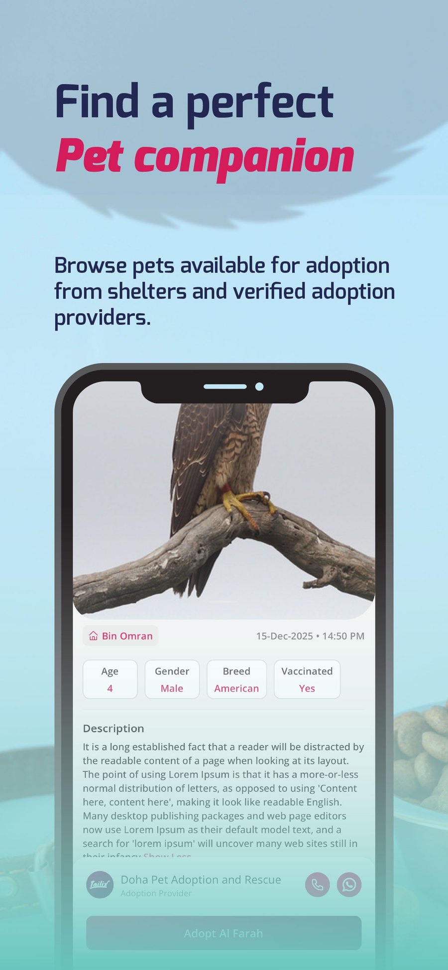
A few of the forty-plus screens — home, categories, product, verified services, checkout and adoption.
· Next project
A reference the region can stand on. →
Launching a product?
Brand, UI and a shippable design system — tell us what it needs to do.
· Related projects
More work from the studio.
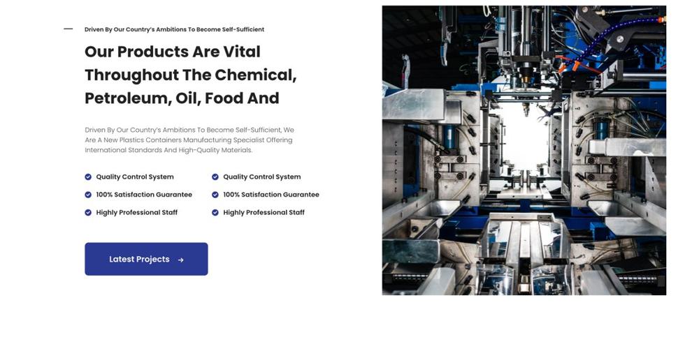
Bilingual, and shipping. — QPlastics
For QPlastics we designed a full brand identity and shipped their new bilingual corporate website together.
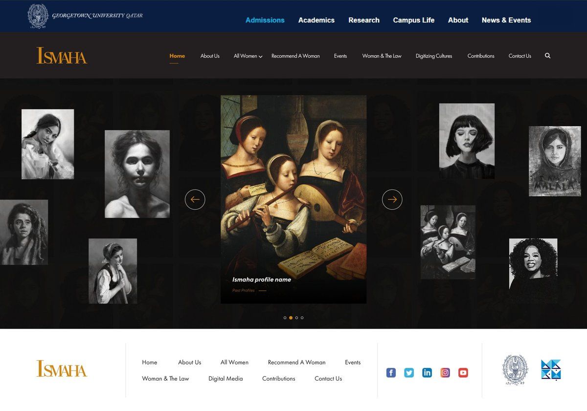
ISMAHA, shipped. — Georgetown University Qatar
A bilingual Next.js platform shipped for ISMAHA at Georgetown University Qatar — research portal with accessible design and Arabic-first UX, by Freezil.
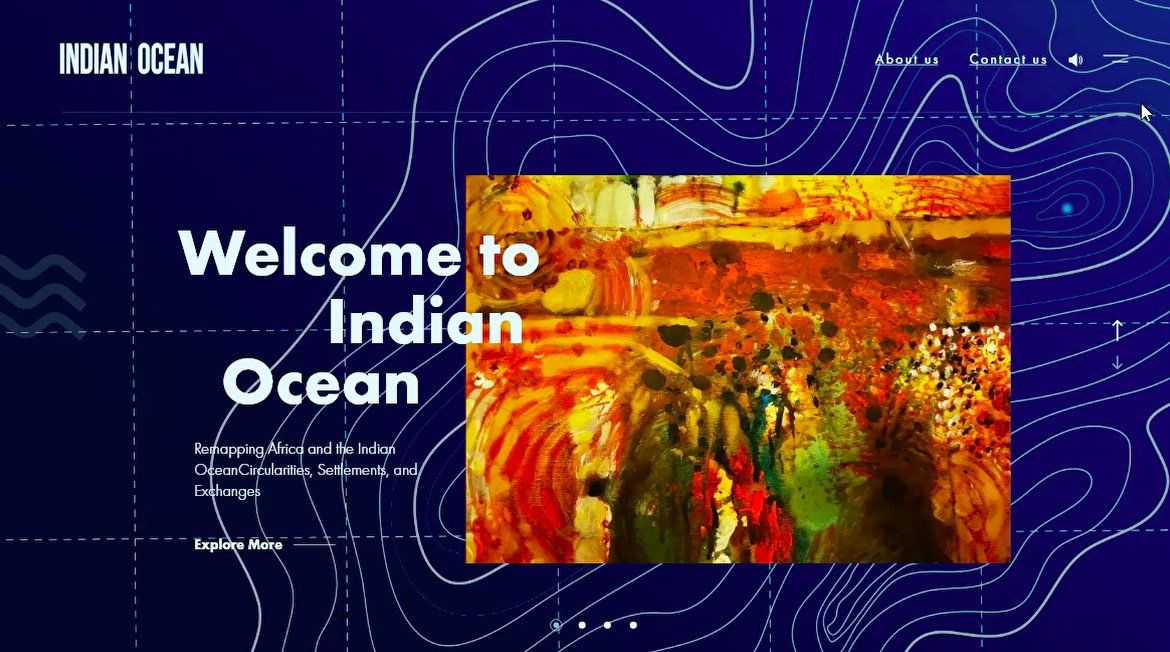
Mapping an ocean. — Georgetown University Qatar
A research microsite for Georgetown University Qatar's Indian Ocean project — a scroll-driven public-facing site with an interactive map.