
Work / A factory, rebranded
A factory, rebranded.
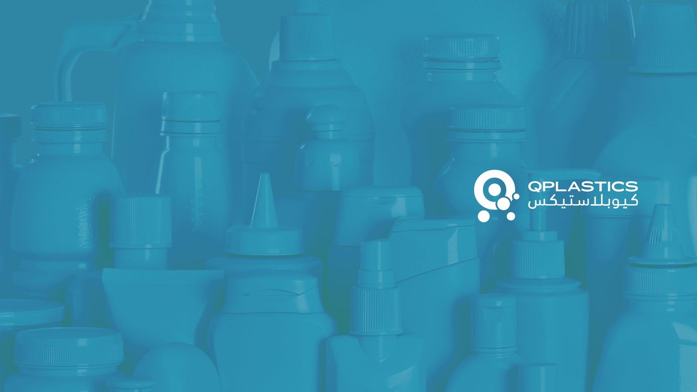
A quiet, industrial-forward rebrand for QPlastics — positioning Qatar's manufacturer for tender work outside the country while staying recognisable to existing customers.
· Overview
The brief
QPlastics wanted a rebrand that could hold its own in an international procurement tender without alienating local customers who'd bought from them for fifteen years.
We designed a technical-forward identity — no stock-industry iconography, no primary-colour plastic clichés. Clean, engineered, measurable. The kind of brand that shows up as a credible line item on a ministry RFP.
1
Full identity
40
Brand-book pages
2
Languages · AR + EN
1
Tender-ready system
· Approach
How we worked
01 — Tender audit
Pulled ten international RFPs, studied how competing brands presented in the shortlist.
02 — Identity as competence
Clean, engineered marks. Technical typography. No warmth for warmth's sake.
03 — Material sample book
Designed a physical sample pack to accompany tender submissions.
04 — Rollout across sales kit
From business cards to site-visit signage to proposal cover sheets.
· Notes
From logo system to van livery.
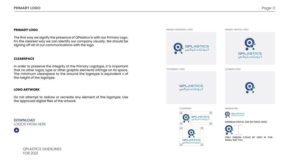
A 40-page identity package — primary logo, AR/EN lockups, color, typography, pattern system, full stationery suite, and the vehicle wrap that makes a delivery visible from across the warehouse car park.
· Design system
The colour system.
An industrial brand that still feels clean — a deep corporate navy, a bright royal blue, and a water teal that nods to the material itself.
Deep Navy
Primary
#1E2A6E
Royal Blue
Secondary
#2733A6
Water Teal
Accent
#2C90B0
Steel Grey
Neutral
#5D678C
· From the work
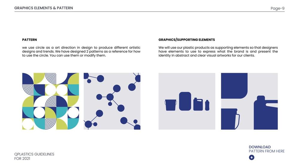
Pages from the rebrand.
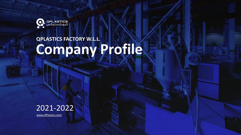
Pages from the QPlastics rebrand presentation — system, applications, rationale.
· Next project
A pharmacy, refreshed. →
Positioning for bigger tenders?
Share your category and the tenders you want to win. Treatment back within a business day.
· Related projects
More work from the studio.
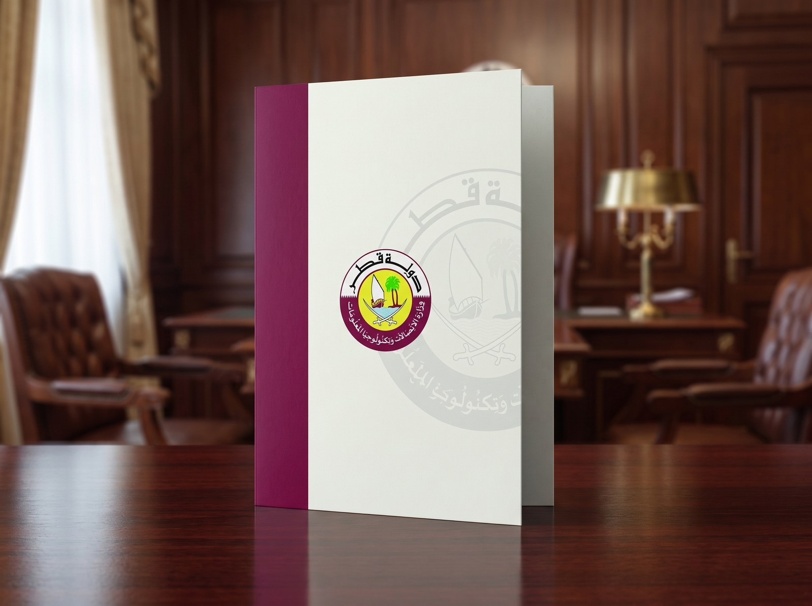
One crest, a whole ministry. — Ministry of Communications & IT · Qatar
A complete bilingual stationery and correspondence system for Qatar's Ministry of Communications & Information Technology — cards, letterhead, notepads, envelopes and document folders, unified under the State of Qatar crest.

Islamic art, modern grammar. — Al Khaleej Takaful
A full rebrand for Al Khaleej Takaful Insurance — geometric Islamic art as a living system, modernised for digital, print, and branch.
A pharmacy, refreshed. — Kulud Pharmacies
A complete brand refresh for Kulud Pharmacy in Qatar — wordmark, packaging system, signage and bilingual rollout, designed in Doha by Freezil.